Toaster 1.9 design: Difference between revisions
Vitor Levi (talk | contribs) No edit summary |
Vitor Levi (talk | contribs) No edit summary |
||
| Line 6: | Line 6: | ||
== Visual Design == | == Visual Design == | ||
=== Screens === | |||
=== Components === | |||
== Image customisation detailed design == | == Image customisation detailed design == | ||
Revision as of 13:18, 7 July 2015
Information architecture
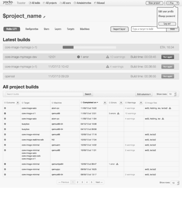
It looks like the structure of the Toaster UI might look like this by the end of 1.9:
Visual Design
Screens
Components
Image customisation detailed design
This video explains the detailed design
The video below explains the image customisation interaction in more detail
Media:Image-customisation.webm
Everything that's shown in the video is now available in the design prototype at
https://yoctoproject.org/toaster
High-level design feedback
This design shown in the video addresses pretty much all the feedback the Toaster contributors have provided so far (listed below). The only items not addressed are 1 (because it would require us to rethink Toaster as a tool for absolute beginners and would impose a very specific workflow) and 8 (because I haven't had time to think about how we can do this, but we can definitely come back to it).
This is the feedback we received:
1. Should this kind of linear process be the main Toaster workflow, instead of the non-linear one currently provided by the existing project page?
2. Size is project configuration dependent, so all size information is a guess, an approximation. We should probably still show it, but the interface needs to present it as such (we need to make sure we don't present it as it was 100% accurate information). The same for dependencies.
3. We need to create states for how the tables will look like when certain information is missing (number of packages, sizes, etc)
4. We need to refine the recipe presentation in the workflow
5. We need to work on the way we present the actions. Do we really need all the ones we have right now?
6. Replace the builds tab with a less prominent way of accessing build information for the custom image recipe.
7. Provide a way to reenter the image customisation process from the build results
8. Provide a way to 'select all' packages returned by a search
9. Do we need the reverse dependencies information in the packages table?
10. Can we add the package size to the visible dependencies information in the packages table?
11. The workflow is still too complex: too many concepts exposed (packages, layers, recipes). Should we just require people to build the image they want to customise instead?
Image customisation high level design
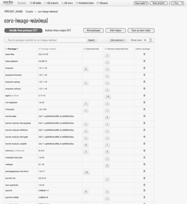
The document below is the outcome of the initial design discussions about image customisation with Toaster. By image customisation we mean the ability to create a customised image recipe by specifying the list of packages it will install.
File:Image customisation in Toaster.pdf
Please send feedback to the Toaster mailing list
Some early thoughts on changes and new functionality
The existing navigation system is too simple and will not cope well with the addition of new functionality. We are planning to add a global navigation and change the project navigation.
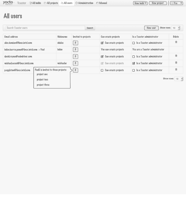
Users
The page that lists existing Toaster users. You can create new users, give them read only access (by project), or 2 different levels of write access: "can create projects" and "Toaster administrator".
Image customisation
You can currently add packages to any image you build by setting IMAGE_INSTALL_append in Toaster. That's clumsy and quite limited. We would like to provide a better way to do image customisation. You start from one of the core Yocto Project images, and you can add remove packages and recipes from / to it. You can then save your changes as a new image recipe that will be added to your own custom layer.


